DocuClip Studio › Alternatives › Flourish bar chart race alternative
Comparison
A Flourish bar chart race alternative for video
Flourish’s bar chart race template is a favourite of newsrooms: upload a spreadsheet and publish an interactive race on a web page. DocuClip Studio renders the race as finished video instead, with flags, counters, event flags and sound, ready for YouTube, Shorts or a documentary timeline.
⚡ Customize This Sample Free in Studio (1-Click Google Sign-In) →
Opens the Oil Producers Bar Race sample in the studio after a free sign-in (Google or e-mail, no card).
What Flourish does well
Flourish is built for interactive, embeddable charts. Its help centre describes the bar chart race template as a way to visualise the changing fortunes of people or groups, with data uploaded from CSV or Excel; for a race the values have to be cumulative. The result lives on a web page, where readers can replay it. The help centre also says you can record a video or GIF of a race for social media, and that paid-plan users can add a race to a story and export it as video; its pricing page lists video export on the Enterprise plan. Free projects carry an attribution link back to Flourish.
Why video is a different job
A race on a web page can be paused, hovered and replayed by the reader. A race in a video has one chance: the viewer sees it once, at the speed you chose, under your narration. That changes the details. Labels have to be readable on a phone, the camera has to follow the action, the change of leader has to land on a beat, and the numbers need a counter people can actually read. DocuClip’s chart engine is built for that: bars re-rank with eased motion, a year odometer and value counters tick along, event flags mark the moments you want to talk about, and each step plays a note in the sound design.
The oil producers sample
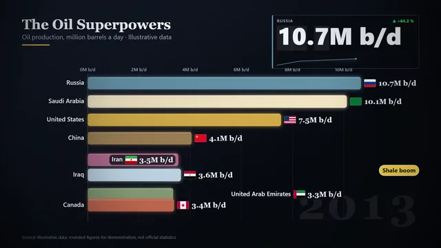
The sample on this page, Oil Producers Bar Race, is a flag bar race of the largest oil producers rendered at 60 fps, with each bar carrying its country flag. Open it to see the data table behind it: replace the numbers with your own sourced figures, change the years and the colours, and the race re-times itself. Samples use widely reported figures with the source named, or are labelled “Illustrative data” on screen; either way, use your own sourced numbers before you publish.
More than bars
The same engine makes line races, dual-metric comparisons, an exact-share donut whose printed slices always add up to 100.0 %, a stacked comparison bar and a candlestick ticker for market crashes. They export as MP4 in 16:9, 9:16 or 1:1, so the same data can become a YouTube insert and a vertical Short.
Using Flourish and DocuClip together
If you publish an interactive version of your chart in an article and also need a video version for social media or a documentary, the two tools complement each other: keep Flourish for the embed, and paste the same table into DocuClip for the video. DocuClip reads pasted CSV or JSON, or you can type straight into its table.
Plans
The Free Explorer, a free account, previews the sample and every chart type under a watermark, at 540p and 24 fps, and exports no files. Creator exports clean 1080p races at up to 60 fps, clips up to 60 seconds; Studio Pro adds 4K, exports up to 10 minutes and transparent alpha, useful for laying a race over footage.
How it compares
| Feature | DocuClip Studio | Flourish |
|---|---|---|
| Built for | Finished video for YouTube, Shorts, Reels and documentaries | Interactive charts and stories published on the web |
| Data | Paste CSV or JSON, or edit the table | Upload CSV or Excel; race values must be cumulative |
| Video file | MP4 rendered in the browser, with sound, on both paid plans | Record a video or GIF of a race; export a story as video on paid plans; video export listed on Enterprise |
| Interactivity | None: the output is a video | Readers can replay and explore the embed |
| Chart types for video | Bar and line races, dual metric, exact-share donut, stacked bar, candlestick ticker | Many interactive templates, including the bar chart race |
| Attribution | None on charts | Free projects include a link back to Flourish |
| Price | Free to explore; paid plans to export (see Pricing) | See its pricing page |
Last reviewed November 2026. This comparison describes how each product works, not its price, and is not based on hands-on benchmarks. Sources: Flourish help centre: bar chart race, flourish.studio/pricing. Features change, so check the vendor’s own site before you decide. Product names belong to their owners; DocuClip Studio is not affiliated with them.
When another tool is better. Flourish is the better choice for interactive charts embedded in articles and newsroom stories, where readers explore the data themselves, and for teams that already publish with it.
Questions
- Can Flourish export a bar chart race as video?
- Its help centre describes recording a race as a video or GIF and, on paid plans, exporting a story as video; its pricing page lists video export on the Enterprise plan. Check Flourish’s current plans for your case.
- Does my data have to be cumulative in DocuClip?
- No. The engine animates whatever values you paste for each step, so you can race cumulative totals or yearly values, whichever tells the story.
- Can the bars carry flags?
- Yes. The Oil Producers Bar Race sample carries a country flag on each bar, which keeps a crowded race readable on a phone.
- Is there sound?
- Yes. Each step of a race plays a note in the documentary sound design and event flags get an accent, so the race has rhythm without a music track.
Free to explore, paid to export
- Free Explorer ($0): a free account (Google or e-mail), no card. Every sample and engine in a watermarked 540p preview at 24 fps (globe scenes are shown flat), 3 custom AI prompts and the pre-rendered sample NLE pack; no file exports.
- Creator ($19 a month or $149 a year): unlimited clean 1080p exports at up to 60 fps, clips up to 60 seconds, for your own channels.
- Studio Pro ($49 a month or $299 a year): 4K at 60 fps, exports up to 10 minutes, the 3D Globe, transparent alpha, batch NLE packs, smart reframe and After Effects .jsx bundles, for client work too.
⚡ Customize This Sample Free in Studio (1-Click Google Sign-In) → Compare the plans